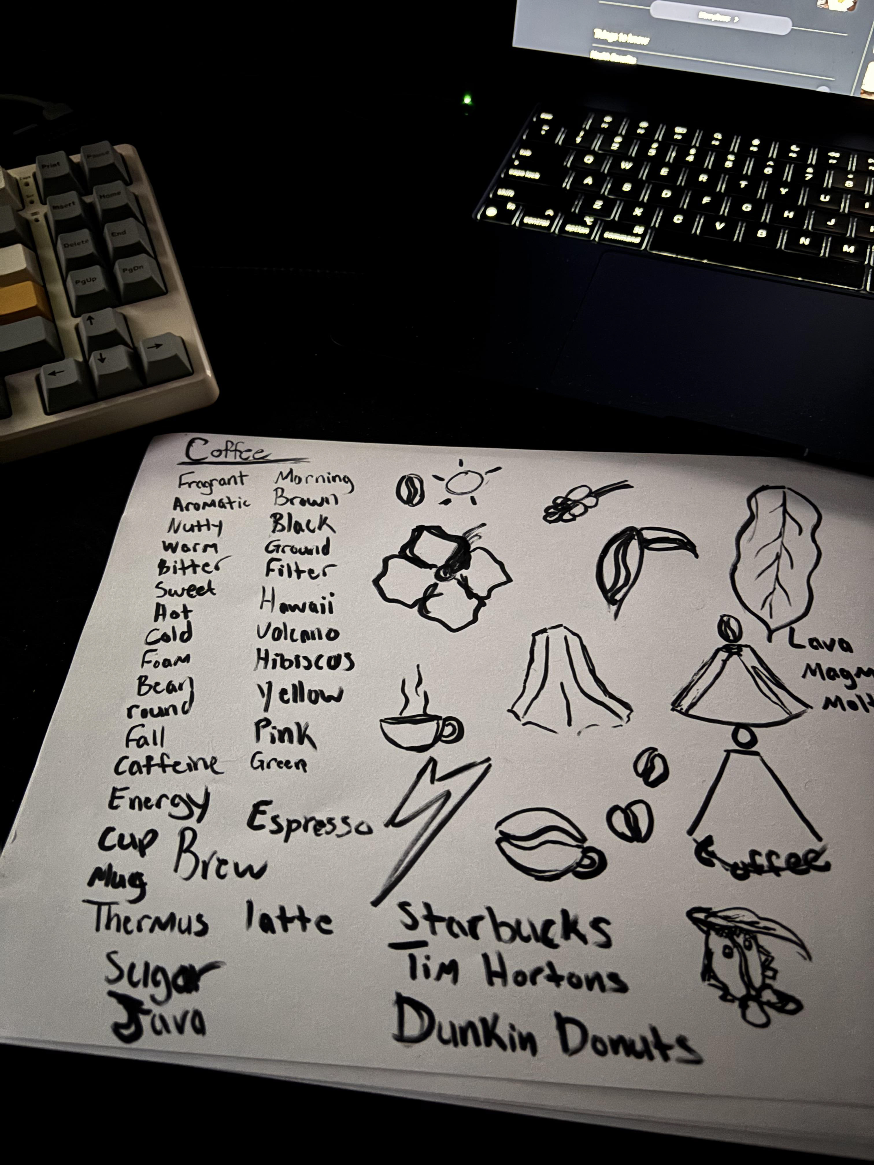
This is how my beginning process looked after I decided on what the subject matter and theme of the project was. It's nothing too crazy, just a word list to help me brainstorm a bit.
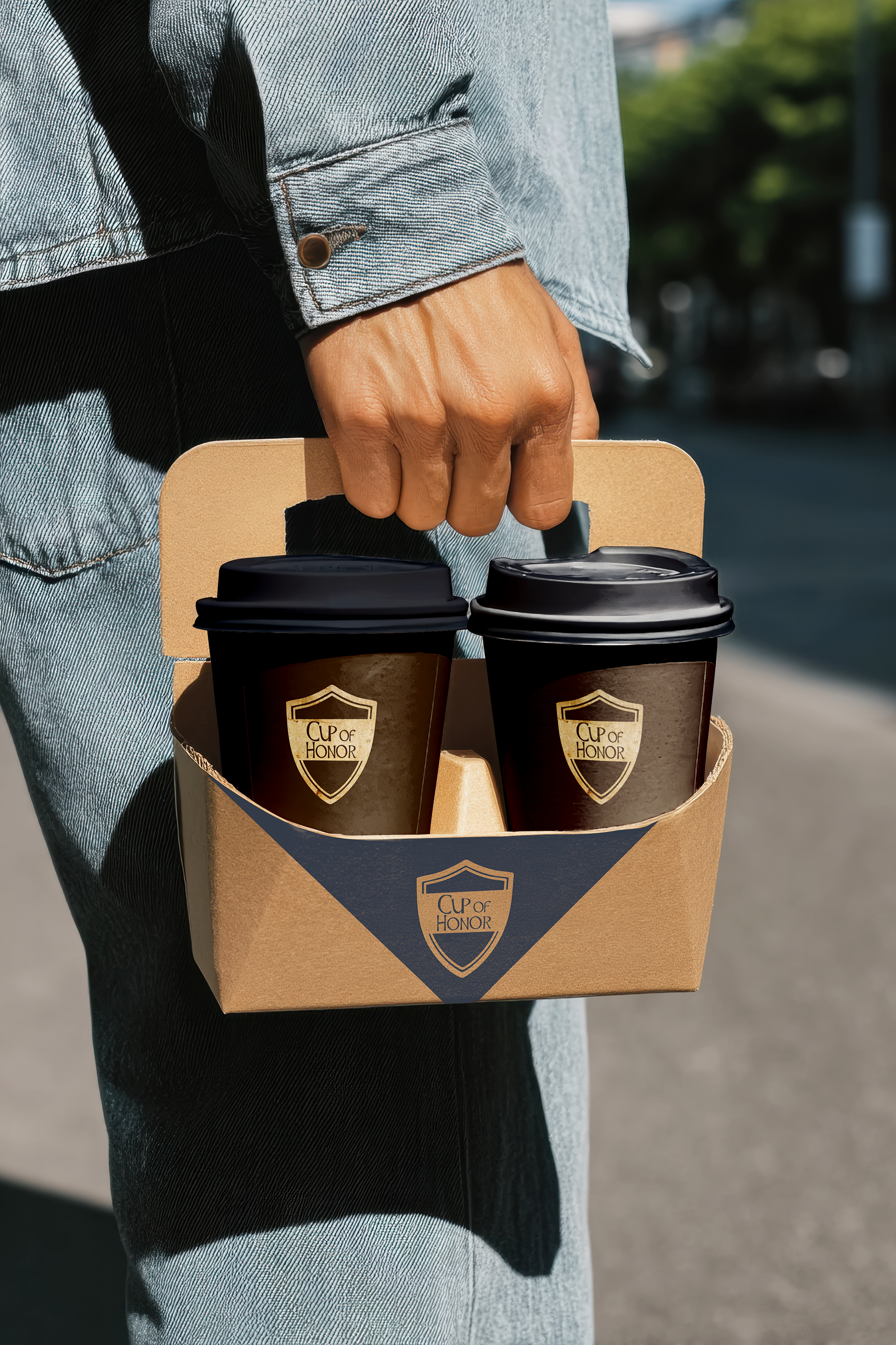
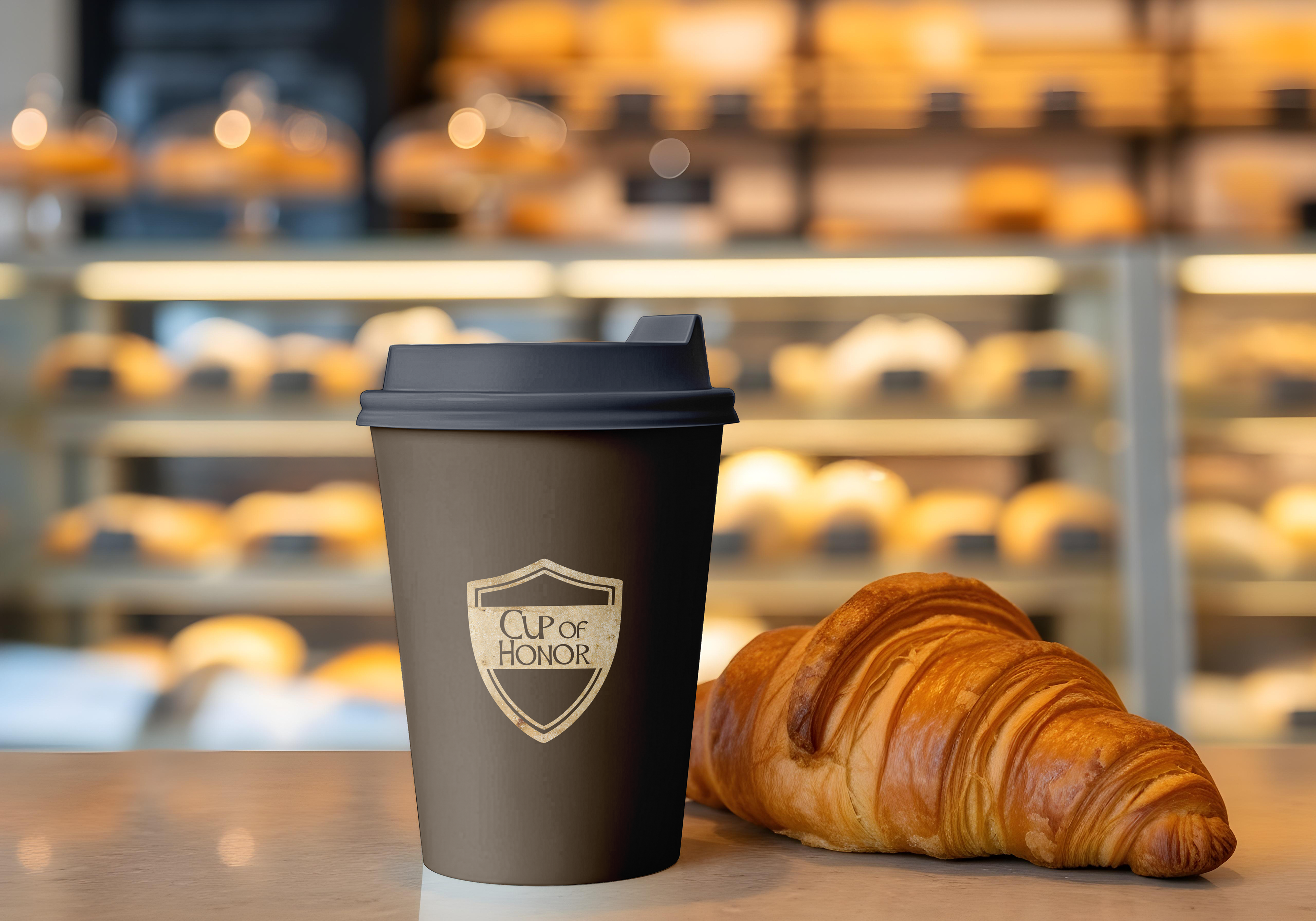
After choosing a name for the company/brand, I had a clear image of what I could do for the name to give it some character that revolves around the subject matter of coffee.
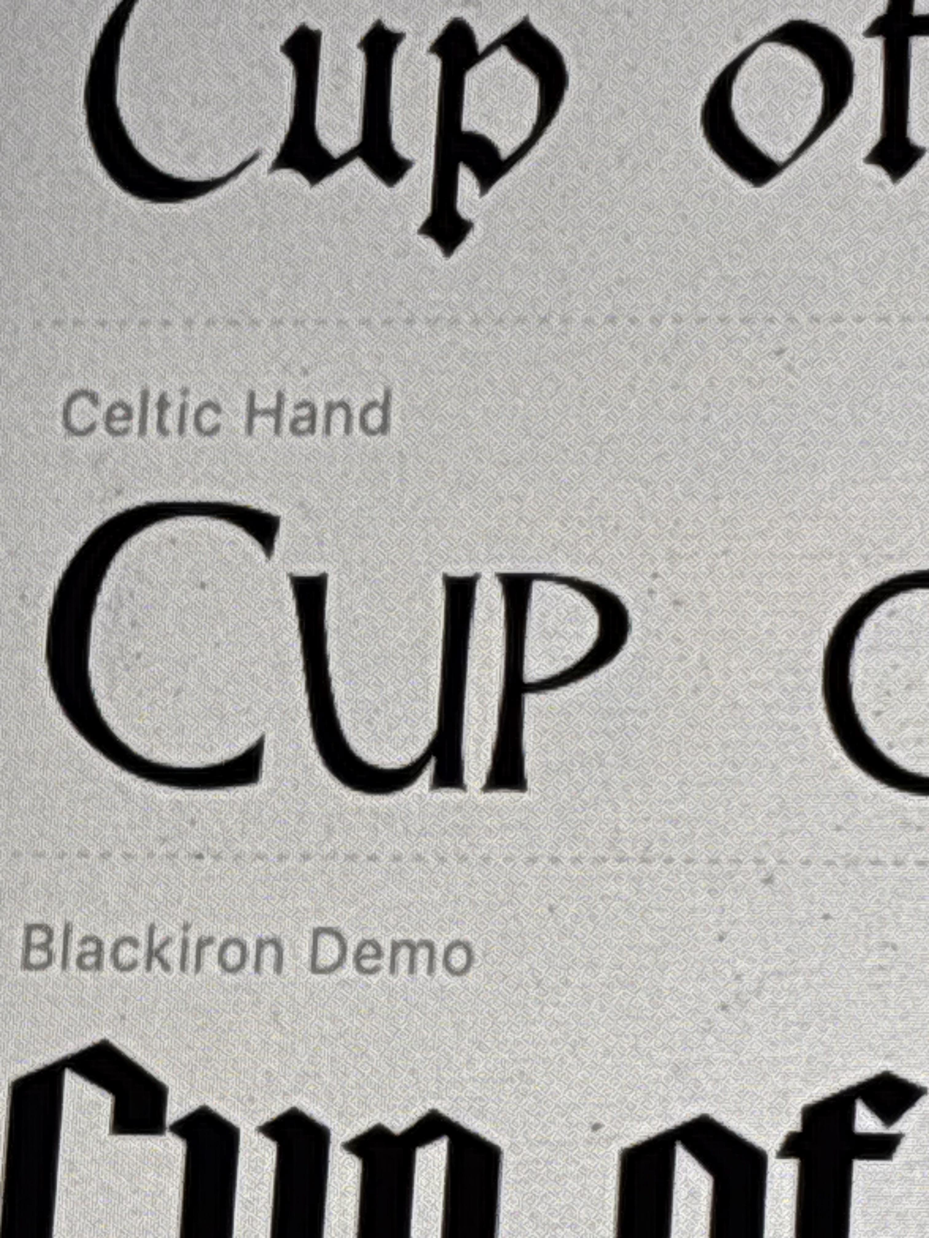
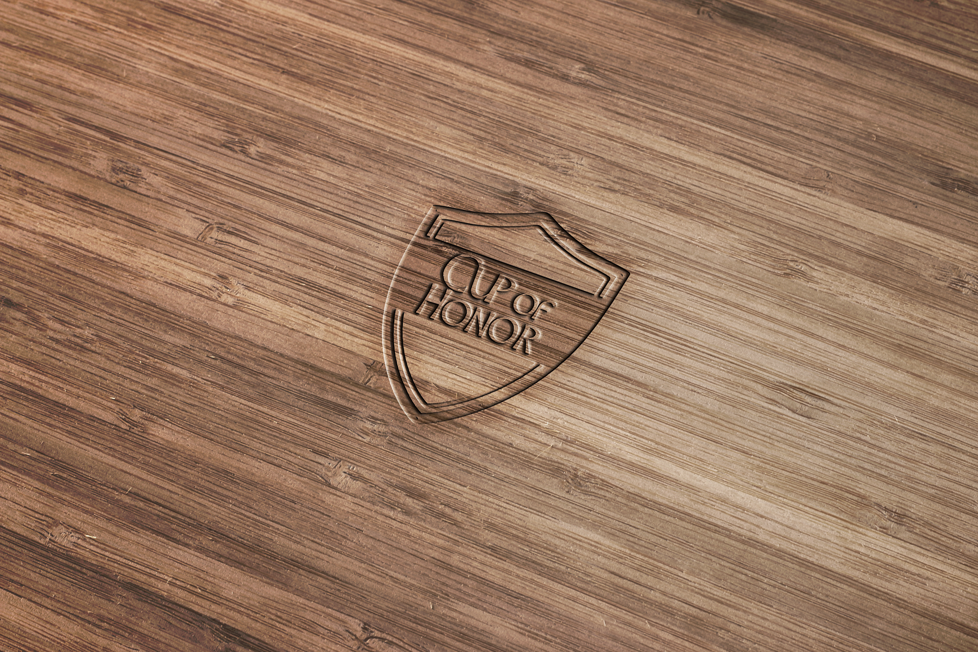
These are the drafts I had for the logo and the shape that would eventually house it. I felt that the Celtic Hand typeface had a better feel to it compared to the other which felt like it was screaming at me.
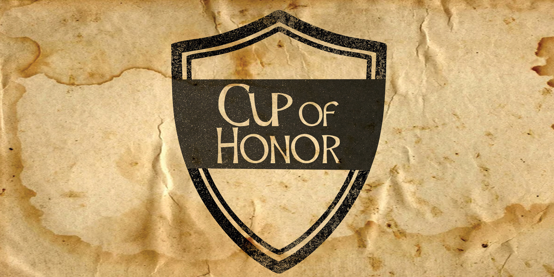
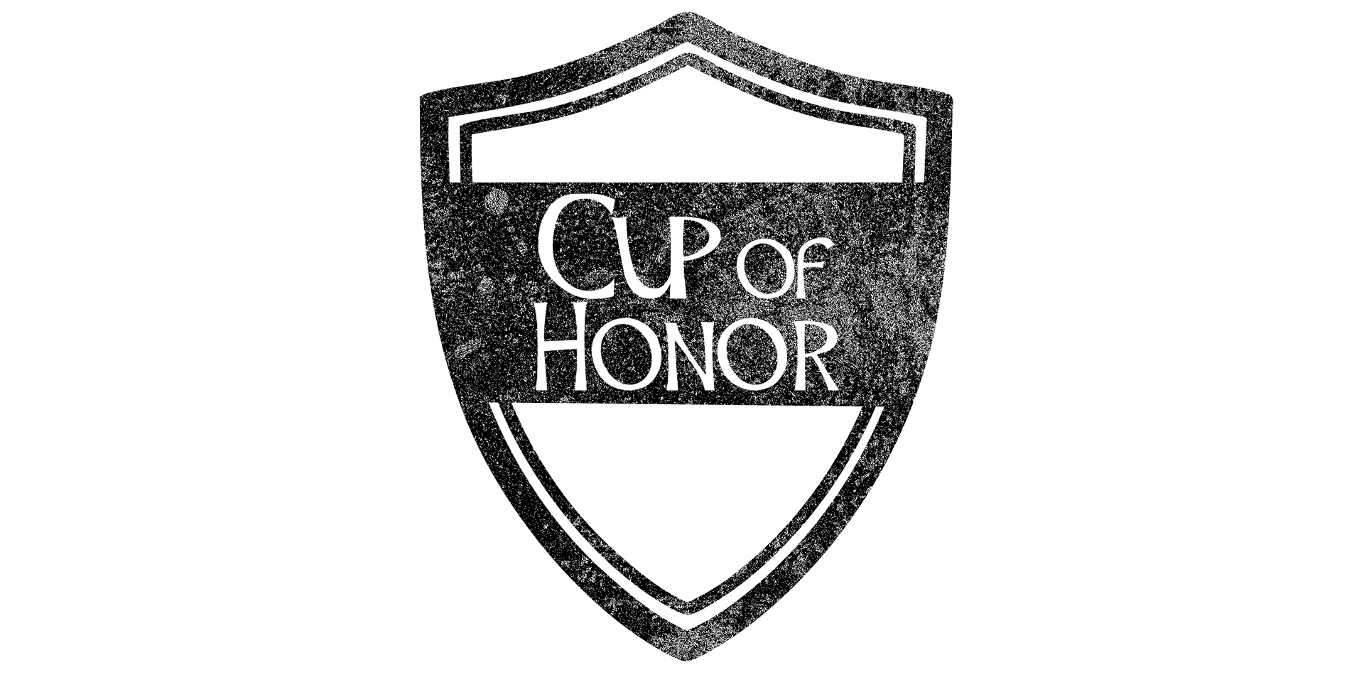
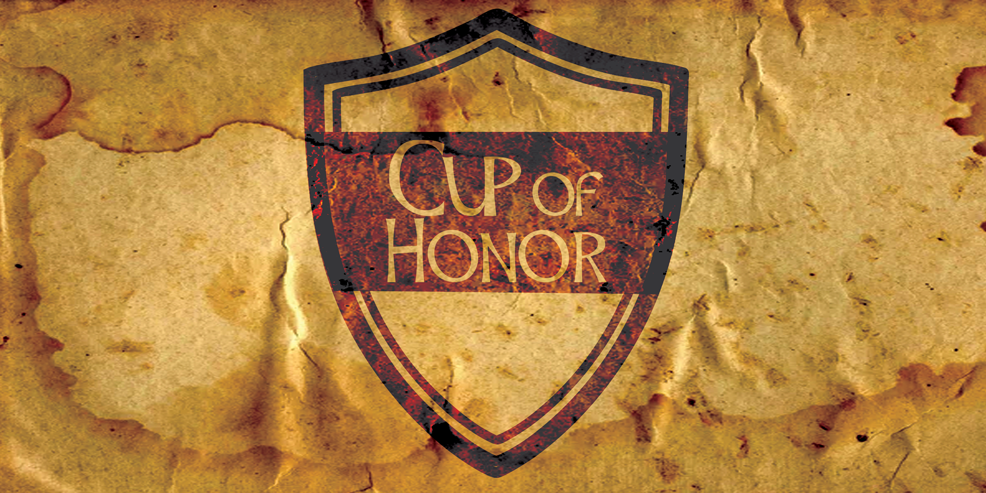
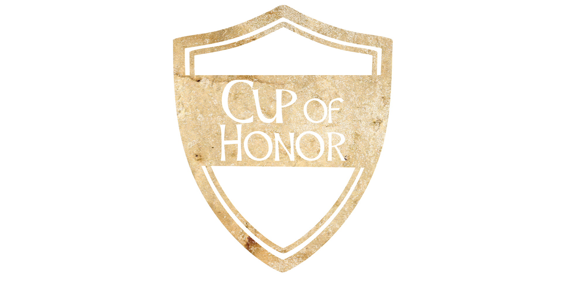
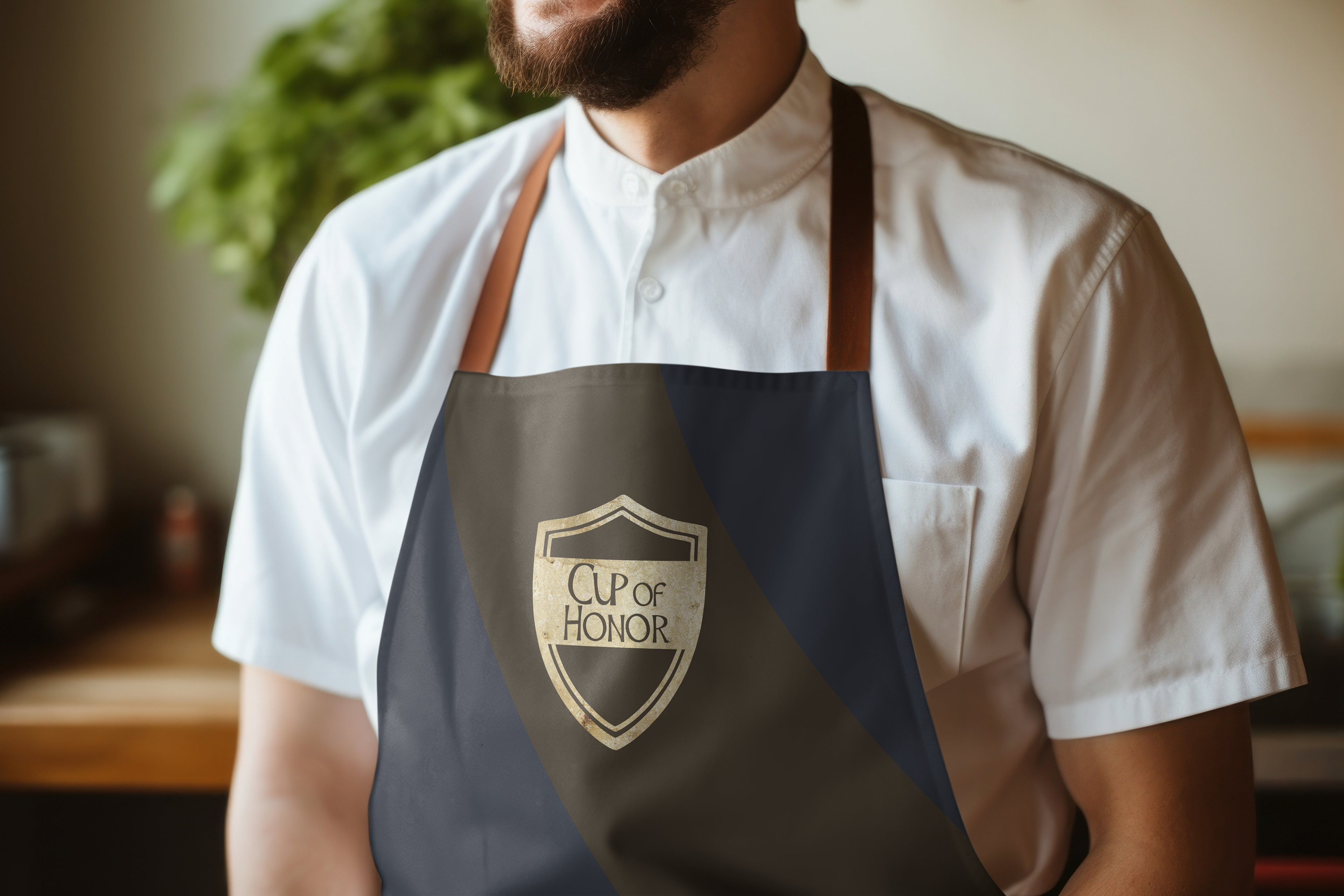
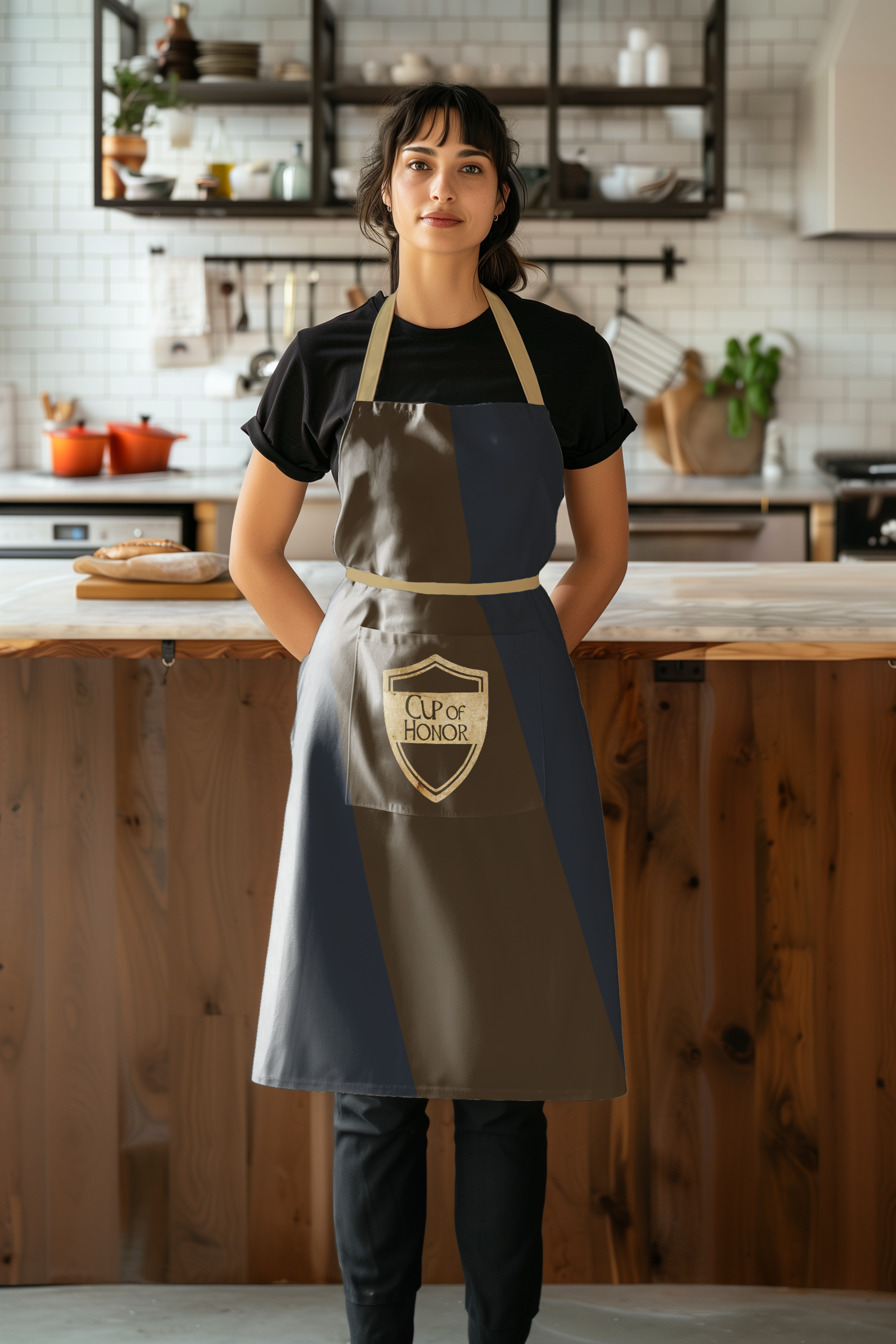
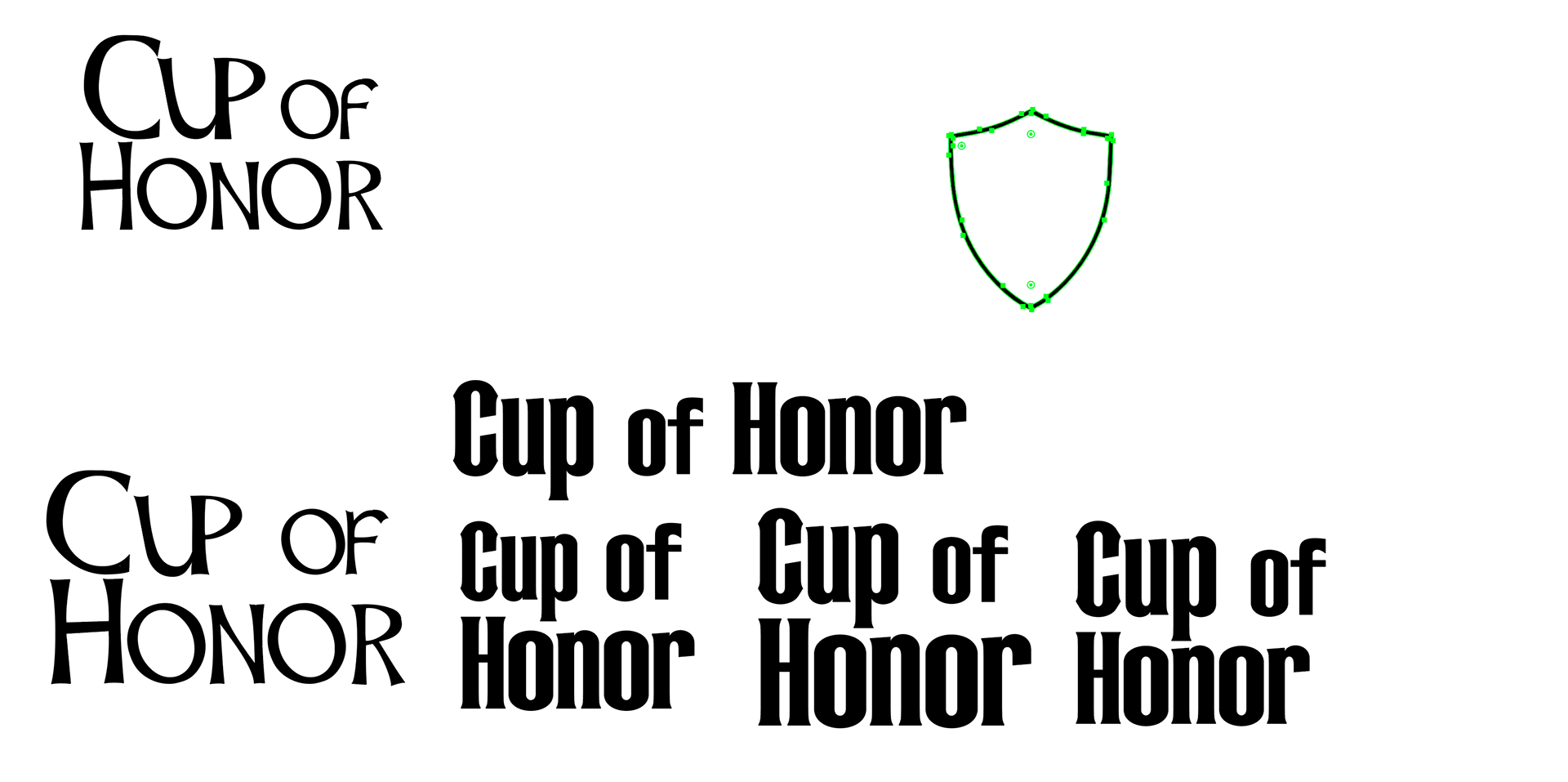
These are different drafts and variations of the logo with the bottom two being the finals.
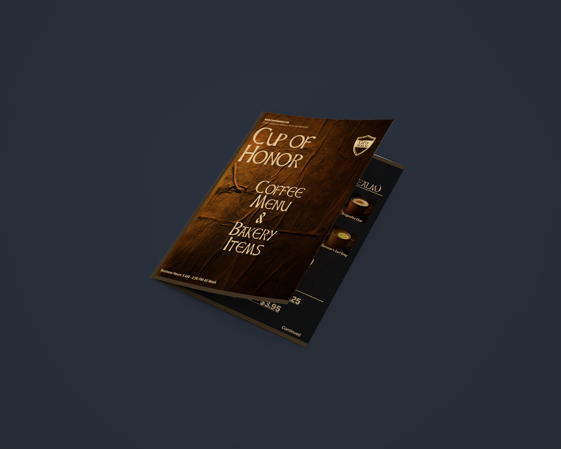
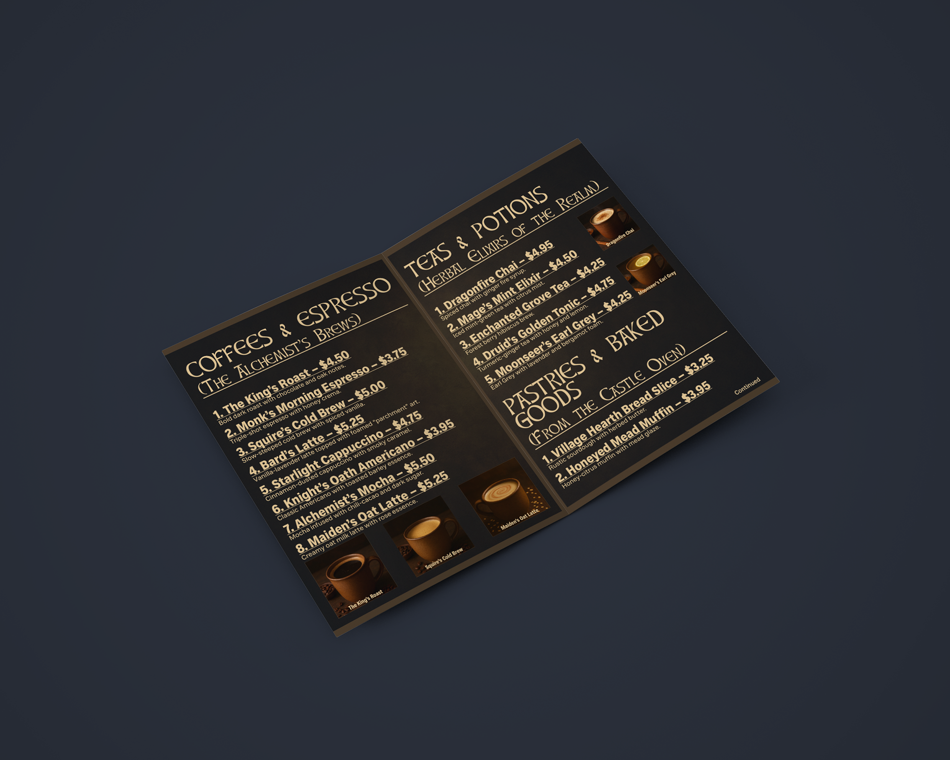
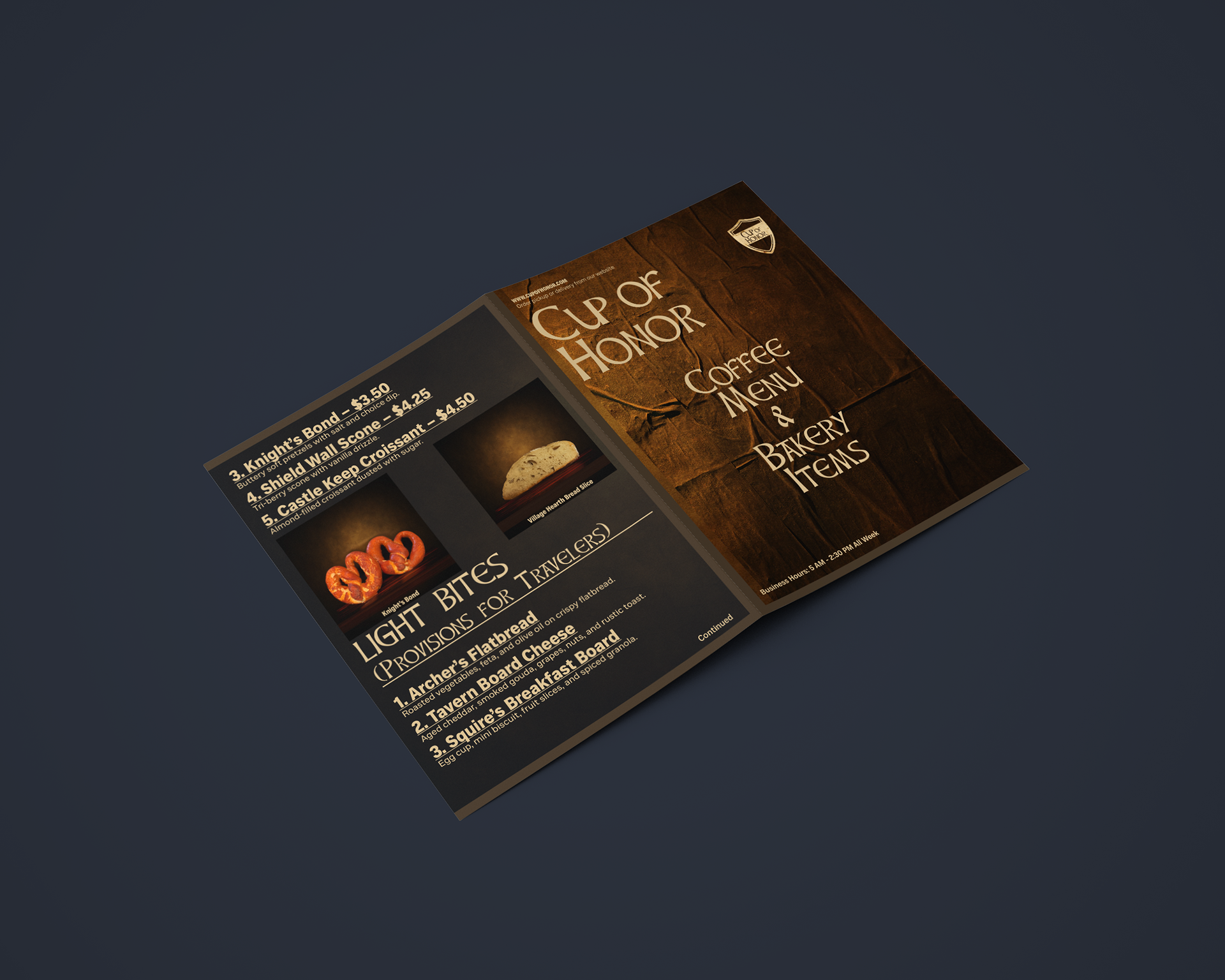
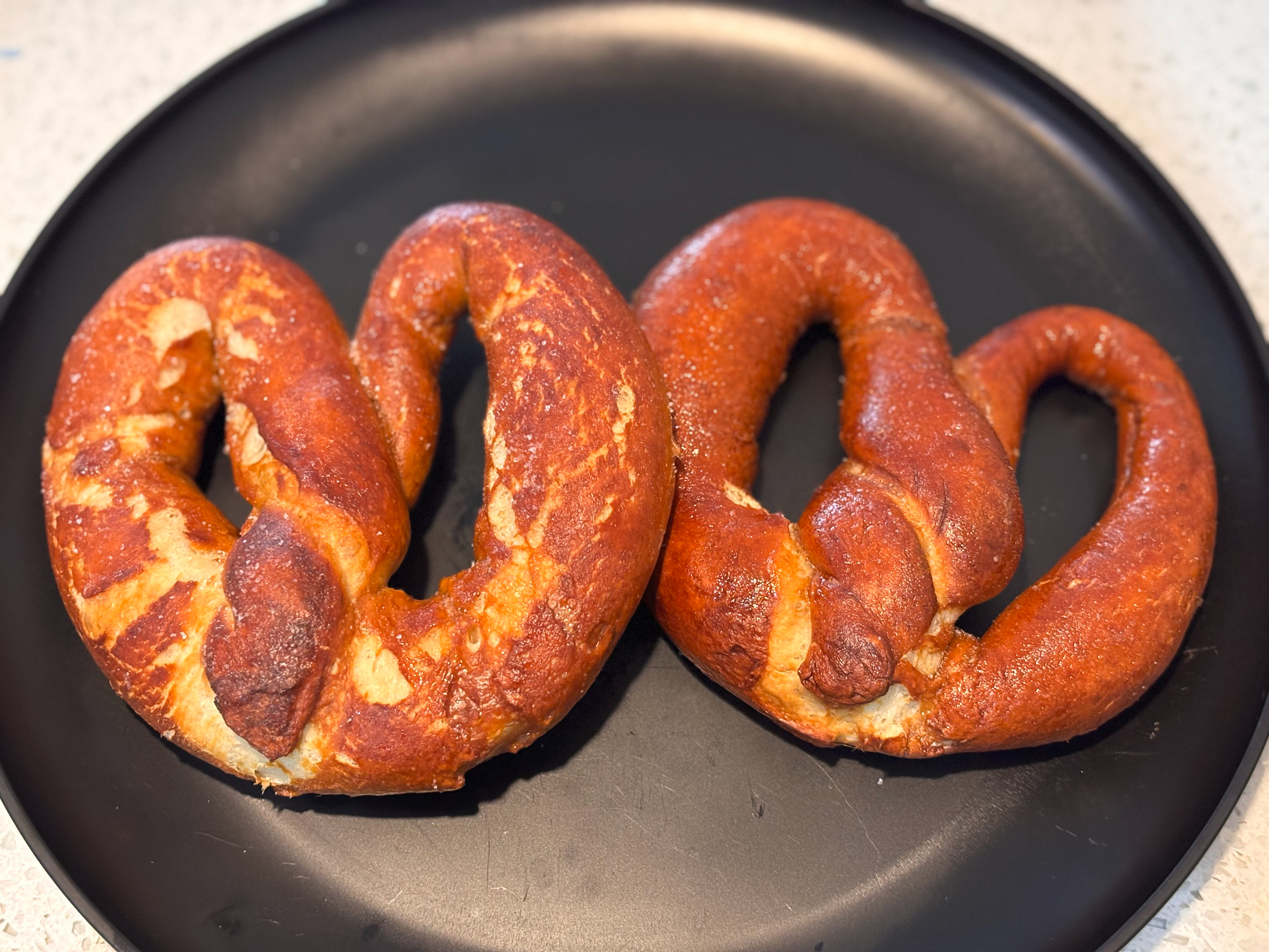
These are the original photos with the edited versions that were used for the menu items shown above.